Alerts
Alert is a notification component which is used to notify user and give a feedback on various events like success, failure, info etc Basically it tells user what is going on , the state of events that has already taken place.
Examples of the Alerts
      <div class="alert alert-success">
        <i class="fa fa-check-circle"></i>
        <strong>Success Alert!</strong>
        This alert box indicates successful or positive action
      </div>

      <div class="alert alert-error">
        <i class="fa fa-times-circle"></i>
        <strong>Error Alert!</strong>
        This alert box indicates a dangerous or potentially negative action.
      </div>

      <div class="alert alert-closing">
        <span>
            <strong>Closing Alert!</strong>
            Alert Bar with a close Button
        </span>

        <button class="fa fa-times" id="alert__close-btn">
        <span class="sr-only">Button</span>
        </button>
      </div>
Usecase
Alerts are used for Drawing attention Its a message that lets user know about states as a feedback
Different types of alerts available are:
To use this components add class="alert" and the
type of the alert to be displayed.
Avatars
Avatar is a component which is used to represent user's identity on various platforms
We can see in places like profile pictures, comment threads, header of webpage different avatars with different sizes are used.
Examples of the Image Avatars
<div class="avatar avatar-sm">
      <img class="avatar__image" src="../docs/assets/avatars/user-48x48.png" alt="user-avatar" />
      </div>

      <div class="avatar avatar-md">
      <img class="avatar__image" src="../docs/assets/avatars/user-female-48x48.png" alt="female-user-avatar" />
      </div>

      <div class="avatar avatar-lg">
      <img class="avatar__image" src="../docs/assets/avatars/identicon.png" alt="identicon" />
      </div>
Examples of the Initial Avatars
Initials are a good way to provide identifying information when no profile image is present. Pairing initials with a unique color can help visually organize comment threads at a glance and provide extra context as to who is commenting.
 <div class="avatar">
      <div class="avatar__letters avatar-sm" role="img">
        SR
      </div>
      </div>

      <div class="avatar">
      <div class="avatar__letters avatar-md" role="img">
        G
      </div>
      </div>

      <div class="avatar">
      <div class="avatar__letters avatar-lg" role="img">
        LJ
      </div>
      </div>
Usecase
In most of the cases you will only need small (sm-32px) and medium (md-48px) size avatars
Different Sizes available for avatars:
sm - 32px md - 48px lg - 64px xlg - 80px xxlg - 96px
To use this components class="avatar" is required
for parent container and sm,md, lg denotes to different avatar
sizes
While using Initial Avatars use
class="avatar__letters" on child element
Badges
Badge (aka Tag) — small overlapped UI item which indicates a status, notification, or event that appears in relativity with the underlying object.
Badge with a Numeric value is used to represent the number of events related to the parent UI item:
Badges On Avatars
       <div class="badge__container">
              <div class="avatar avatar-xxlg">
                  <img class="avatar__image" src="../docs/assets/avatars/male_avatar.svg" alt="male-avatar">
              </div>
                  <span class="badge badge-status-active"></span>
          </div>

          <div class="component__display--container">
                <div class="badge__container">
                 <i class="fas fa-shopping-cart fa-4x"></i>
                 <span class="badge badge-icon badge-status-number">5</span>
          </div>
Badges on Icons
Usecase
- In conversational patterns (Chat, Messages, Inbox) Badge used to inform about new incoming messages. Dot distinctly divides fresh emails and recent
- In most shopping apps Badges are used to display the number of products added to a cart
Buttons
Buttons are very important element on web , Buttons are generally used for actions like submit form data, search data and many more.
Buttons are known as CTA element(call to action). It is designed in such a way that button takes user attention.
Examples of Primary Button Styles
              <button class="btn btn-primary" type="button">.btn-primary</button>

              <button class="btn btn-primary-outline" type="button">.btn-primary-outline</button>

              <a class="btn btn-primary-link" role="button" tabindex="0">.btn-primary-link</a>


              <input class="btn btn-primary-outline" type="image" role="button" src="../docs/assets/avatars/user-48x48.png" alt="user-img-button">

              <a class="btn btn-primary-icon" role="button">

                  <span class="btn-icon">
                      <i class="fas fa-rupee"></i>
                  </span>
                  SELL
              </a>
Examples of Secondary Button Styles
<button class="btn btn-secondary" type="button">.btn-secondary</button>
          <button class="btn btn-secondary-outline" type="button">.btn-secondary-outline
          </button>

          <a class="btn btn-secondary-link" role="button" tabindex="0">.btn-secondary-link</a>

          <input class="btn btn-secondary-outline" type="image" role="button" src="../docs/assets/avatars/user-48x48.png" alt="user-img-button">

          <a class="btn btn-secondary-icon" role="button">
              <span class="btn-icon">
              <i class="fas fa-shopping-bag fa-2x"></i>
              </span>
              BUY
          </a>
Examples Of Disabled Buttons Styles
<button type="button" class="btn btn-primary btn-disabled" type="button">.btn-primary btn-disabled</button>

          <a class="btn btn-disabled" role="button" tabindex="-1">.btn-disabled</a>

          <button type="button" class="btn btn-secondary btn-disabled" type="button">.btn-secondary btn-disabled</button>

          <a class="btn btn-disabled" role="button" tabindex="-1">.btn-disabled</a>
Examples of Floating Buttons Styles
<div class="btn btn-primary float-action-btn">
              <span>+</span>
          </div>
          <div class="btn btn-secondary float-action-btn">
              <span>+</span>
          </div>
Usecase
- There a 2 types of buttons over here one is with anchor(a) tag and other is made using button tag
- So Normal use anchor tag is preferred over button element.
- Button tag can be used for functinal tasks like submit data, change theme etc.
- All the classes for button component are displayed on components.
Card
Teaser Blog Cards
-
Indian Architecture
Srirangam also known as Thiruvarangam, is an island of the city of Tiruchirappalli and a part of Tiruchirappalli Metropolitan Area in the Indian state of Tamil Nadu. A river island, Srirangam is bounded by the Kaveri River on one side and its distributary Kollidam on the other side.
Blog By Dheeraj Purohit
-
Kalaripayattu
Kalaripayattu is a martial art designed for the ancient battlefield (the word "Kalari" meaning "battlefield"), with weapons and combative techniques that are unique to India. Like most Indian martial arts, Kalaripayattu contains rituals and philosophies inspired by Hinduism.
Blog By Dheeraj Purohit
-
Dwarka Dham
Dwarka is an ancient city in the northwestern Indian state of Gujarat. It’s known as a Hindu pilgrimage site. The ancient Dwarkadhish Temple has an elaborately tiered main shrine, a carved entrance and a black-marble idol of Lord Krishna. Dwarka Beach and nearby Dwarka Lighthouse offer views of the Arabian Sea. Southeast, Gaga Wildlife Sanctuary protects migratory birds and endangered species like the Indian wolf.
Blog By Dheeraj Purohit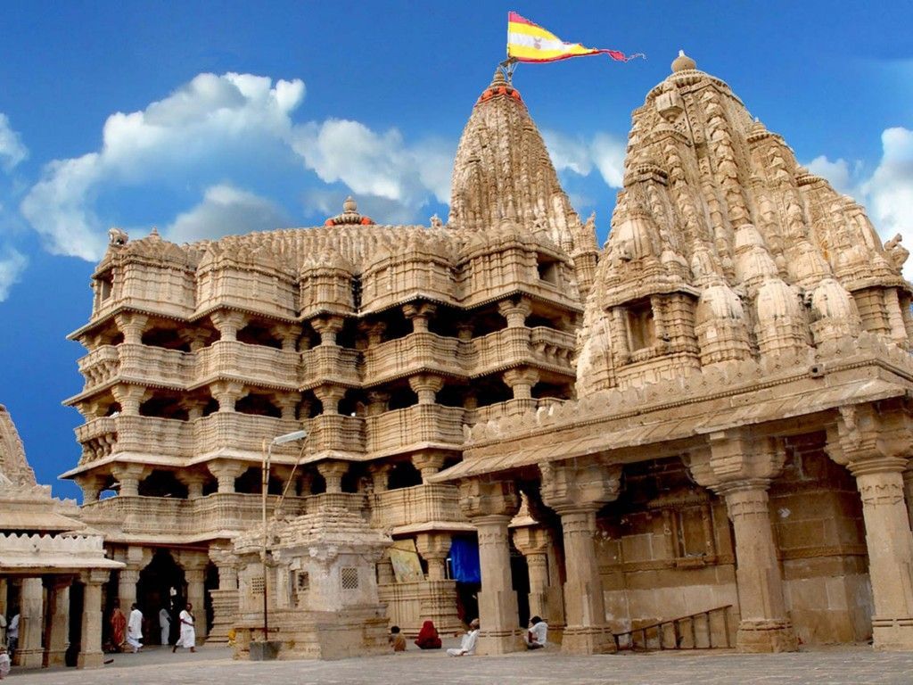
-
Jagannath Swami
Lord Jagannath is presiding deity and King of Puri. Jagannathji idol is made up of wood He is significant regionally in the Indian states of Odisha, Chhattisgarh, West Bengal, Jharkhand, Bihar, Gujarat, Assam, Manipur and Tripura.
Blog By Dheeraj Purohit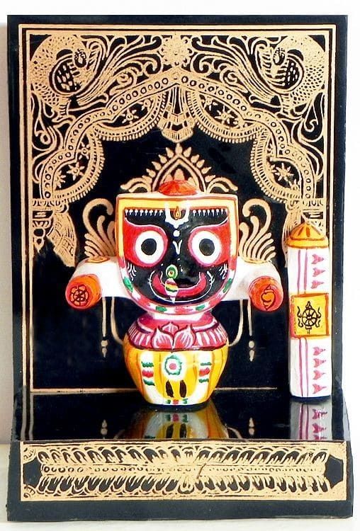
          <li class="card text-center">
          <div class="card-text">
             <h6 class="h6">
                <a
                   href="#index.html"
                   class="card-link"
                   aria-describedby="vertical-card-description"
                   >Indian Architecture</a
                   >
             </h6>
             <p class="p-sm text-left">
                Srirangam also known as Thiruvarangam, is an island of the city of
                Tiruchirappalli and a part of Tiruchirappalli Metropolitan Area in
                the Indian state of Tamil Nadu. A river island, Srirangam is
                bounded by the Kaveri River on one side and its distributary
                Kollidam on the other side.
             </p>
             <span
                class="btn-secondary"
                aria-hidden="true"
                role="button"
                id="vertical-card-description"
                >
             Read More
             </span>
             <small class="text-right">
             Blog By <a href="#">Dheeraj Purohit </a>
             </small>
          </div>
          <div class="card-cover">
             <img src="../docs/assets/images/shrirangam.jpg" alt="shrirangam" />
          </div>
       </li>
Product Cards
-
Shri Ganesh Idol
Material : Made with Oxidized Silver/available in Gold / Brass
Add To Cart Buy Now Price: 40,000/-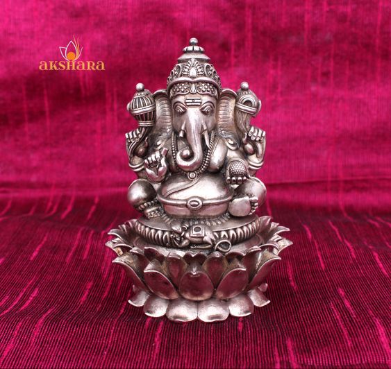 Popular
 -
Saraswati Mata Idol
Made with Oxidized Silver/available in Gold / Brass
Add To Cart Buy Now Price: 50,000/- New
New
          <ul class="card-container list-style-none">
          <li class="card text-center">
             <div class="card-text">
                <h6 class="h6">
                   <a
                      href="#index.html"
                      class="card-link"
                      aria-describedby="vertical-card-description"
                      >Shri Ganesh Idol</a>
                </h6>
                <p class="p-sm text-left">
                   Material : Made with Oxidized Silver/available in Gold / Brass
                </p>
                <span
                   class="btn-secondary"
                   role="button"
                   >
                Add To Cart
                </span>
                <span
                   class="btn-secondary-outline"
                   role="button"
                   >
                Buy Now
                </span>
                <small class="text-left">
                Price: <a href="#"><i class="fa fa-rupee"></i></a>
                <span class="price-tag">40,000/-</span>
                </small>
             </div>
             <div class="card-cover badge-container">
                <img src="../docs/assets/images/shriganesh_silver.jpg" alt="shriganesh_silver" />
                <div class="badge badge-top">Popular
                </div>
                <div class="badge badge-icon">
                   <i class="far fa-heart fa-2x"></i>
                </div>
             </div>
          </li>
          <li class="card text-center">
             <div class="card-text">
                <h6 class="h6">
                   <a
                      href="#index.html"
                      class="card-link"
                      aria-describedby="vertical-card-description"
                      >Saraswati Mata Idol</a>
                </h6>
                <p class="p-sm text-left">
                   Made with Oxidized Silver/available in Gold / Brass
                </p>
                <span
                   class="btn-secondary"
                   role="button"
                   >
                Add To Cart
                </span>
                <span
                   class="btn-secondary-outline"
                   role="button"
                   >
                Buy Now
                </span>
                <small class="text-left">
                Price: <a href="#"><i class="fa fa-rupee"></i></a>
                <span class="price-tag">50,000/-</span>
                </small>
             </div>
             <div class="card-cover badge-container">
                <img src="../docs/assets/images/saraswatimata_silver.jpg" alt="shriganesh_silver" />
                <div class="badge badge-top">New
                </div>
                <div class="badge badge-icon">
                   <i class="far fa-heart fa-2x"></i>
                </div>
             </div>
          </li>
       </ul>
Card With Text and Dismiss
-
Card Title
Lorem ipsum dolor sit amet consectetur, adipisicing elit. Doloremque fugit magnam, labore quibusdam repudiandae perferendis dolor non praesentium commodi! Rem adipisci quia pariatur, eius voluptates unde quae eligendi sed suscipit! lo
Read More Author : Author Name
  <li class="card text-center">
   <div class="card-text">
      <h6 class="h6 ">
         <a
            href="#index.html"
            class="card-link "
            aria-describedby="vertical-card-description"
            >Card Title</a>
      </h6>
      <p class="p-sm">
         Lorem ipsum dolor sit amet consectetur, adipisicing elit. Doloremque fugit magnam, labore quibusdam repudiandae perferendis dolor non praesentium commodi! Rem adipisci quia pariatur, eius voluptates unde quae eligendi sed suscipit!
         lo
      </p>
      <span
         class="btn-secondary"
         role="button"
         >
      Read More
      </span>
      <small class="text-right">
      Author :
      <a href="#">Author Name</a>
      </small>
   </div>
   <div class="card-cover badge-container">
      <div class="badge badge-icon">
         <i class="fas fa-times"></i>
      </div>
   </div>
</li>
Horizontal Cards
-

Indian Architecture
Srirangam also known as Thiruvarangam, is an island of the city of Tiruchirappalli and a part of Tiruchirappalli Metropolitan Area in the Indian state of Tamil Nadu. A river island, Srirangam is bounded by the Kaveri River on one side and its distributary Kollidam on the other side.
Usecase
- Cards with li provides better accessiblity
-
Use
class=".card-horizontal"to make your card horizontal by default card is vertical based on most of the usecase.
Images
Images can be customised to be responsive, round shaped and some performance parameters like resolution switching, density switching can be added.
Responsive Image
Responsive images will automatically adjust to fit the size of the container.

<img class="responsive-image" src="../docs/assets/images/shrirangam.jpg" alt="shrirangam-reponsive-img"/>Round Shaped Images

<img class="round-image responsive-image" src="../docs/assets/images/suryanarayan.jpg" alt="sun"/>Usecase
- Responsive Images can be used as Background Cover Photos
- Round Images can be used as avatars for user identity
-
To make use of this utility add
class="responsive-image"andclass="round-image"for round Images on your image. - Make Sure you add a wrapper around your images to handle its dimensions easily
Inputs
Forms are the backbone of Web, Form is the reason for which web was made for. There are various types of inputs we can use to take input from user in our applications which we are going to see in this section.
so form is used to collect user input. The user input is most often sent to a server for processing.
Accessible Form Controls
Accessible forms are easy to understand, complete, and submit. Instructions, cues, required form fields, and field formatting requirements must be clearly identified to users. Error recovery must be intuitive and descriptive.
Text Inputs
      <form class="form-field flex-column">

         <label class="input-label" for="name">Name:
         </label>

         <input class="input-field" type="text" aria-labelledby="name" autocomplete="name" placeholder="Inclusive UI"/>

         <label class="input-label" for="password">Password:
         </label>

         <input class="input-field" type="password"
         aria-labelledby="password" autocomplete="new-password" placeholder="*******">
      </form>
Checkboxes & Radio Buttons
<fieldset>
        <legend>Choose a shipping method:</legend>
        <input id="overnight" type="radio" name="shipping" value="overnight">
        <label for="overnight">Overnight</label><br>
        <input id="twoday" type="radio" name="shipping" value="twoday">
        <label for="twoday">Two day</label><br>
        <input id="ground" type="radio" name="shipping" value="ground">
        <label for="ground">Ground</label>
      </fieldset>
The fieldset contains the group of checkboxes, and the legend labels the group. Screen readers may repeat the legend for each control in the group, so the legend text should be brief and descriptive.
Fieldset and legend should only be used when a higher-level label is necessary. Nested fieldsets can cause odd screen reader behavior and should be avoided.
Validation
      <form class="form-field flex-column" onsubmit="return false">
         <h3>VALIDATION</h3>

         <div class="input-wrapper flex-column">
         <label class="input-label label-required" for="email">
         Email
         </label>

         <input class="input-field"
         aria-labelledby="email" type="email"
         placeholder="Enter Your Email"
         autocomplete="email"
         required
         />

         <label class="input-label label-required" for="password">Password</label>
         <input class="input-field" aria-labelledby="password"
         type="password"
         placeholder="Enter Password"
         autocomplete="current-password"
         required/>

         <div class="redirect flex-row">
         <label class="input-label"><input class="input-filed" type="checkbox">Remember me</label>
         <a href="#images">Forgot Your Password ? </a>
         </div>
         </div>
         <input type="submit" name="login-button" class="form-submit" value="Submit"/>
      </form>
Usecase
-
you can use
class="input-field"for styling inputs andclass="form-field"for forms -
you can add
class="label-required"for adding * after the label. - For layout parts there are 2 classes flex-row and flex-column can be used for arranging the form elements.
-
To make use of Validating styles use
.input-wrapperwrap it around your inputs.
Text Utilities
Text is the most used content on web It Becomes very important to use heading appropriately on your webpage.
Examples of Differen Text Heading
H1 Heading Example
H2 Heading Example
H3 Heading Example
H4 Heading Example
H5 Heading Example
H6 Heading Example
              <h1 class="h1">H1 Heading Example</h1>
              <h2 class="h2">H2 Heading Example</h2>
              <h3 class="h3">H3 Heading Example</h3>
              <h4 class="h4">H4 Heading Example</h4>
              <h5 class="h5">H5 Heading Example</h5>
              <h6 class="h6">H6 Heading Example</h6>
Examples of Small Text
Paragraph with Large Text
Paragraph with medium Text
Paragraph with small Text
<p class="p-lg">Paragraph with Large Text</p>
          <p class="p-md">Paragraph with medium Text</p>
          <p class="p-sm">Paragraph with small Text</p>
Examples Of Gray Text
Hello I am TEXT in GRAY
I have More Darker shade than you
Oh! Really you haven't seen more darker yet?
Hey Kids what happened who is darker than me?
<p class="p-md gray-lt">Hello I am TEXT in GRAY</p>
          <p class="p-md gray-md">I have More Darker shade than you</p>
          <p class="p-md gray-dk">Oh! Really you haven't seen more darker yet?</p>
          <p class="p-md gray-dkst">Hey Kids what happened who is darker than me?</p>
Examples of Center Text
H1 TEXT : AM IN CENTER ?
Yes You are in center
Hey P you are aligned Right <h1 class="h1 text-center"> H1 TEXT : AM IN CENTER ?</h1>
<p class="p-md gray-md text-right">Yes You are in center</p>
<small class="p-sm text-left">Hey P you are aligned Right</small>Usecase
- Use Heading in a chronological order from large to small.
- As a rule of thumb use one h1 per webpage.
- by just using class you can apply this heading, paragraph style on block level, inline elements.
- The heading components block level margins are 0 so you can use it directly without any modification.
Lists
List is a very useful component in real life as well as on web
we can see lists are used in navigation, displaying elements in order, Menus etc
Examples of Unordered List with bullets
- List Item 1
- List Item 2
- List Item 3
- List Item 4
- List Item 1
- List Item 2
- List Item 3
- List Item 4
- List Item 1
- List Item 2
- List Item 3
- List Item 4
          <ul class="styled-list">
          <li>List Item 1</li>
          <li>List Item 2</li>
          <li>List Item 3</li>
          <li>List Item 4</li>
          </ul>

          <ul class="styled-list list-style-circle">
          <li>List Item 1</li>
          <li>List Item 2</li>
          <li>List Item 3</li>
          <li>List Item 4</li>
          </ul>

          <ul class="styled-list list-style-square">
          <li>List Item 1</li>
          <li>List Item 2</li>
          <li>List Item 3</li>
          <li>List Item 4</li>
          </ul>
Examples of Ordered List
- List Item with numbers
- List Item with numbers
- List Item with numbers
- List Item with numbers
- List Item reversed
- List Item reversed
- List Item reversed
- List Item reversed
- List Item with upper alphabets
- List Item with upper alphabets
- List Item with upper alphabets
- List Item with upper alphabets
- List Item with lower alphabets
- List Item with lower alphabets
- List Item with lower alphabets
- List Item with lower alphabets
- List Item with upper romans
- List Item with upper romans
- List Item with upper romans
- List Item with upper romans
- List Item with lower romans
- List Item with lower romans
- List Item with lower romans
- List Item with lower romans
<ol class="styled-list">
             <li>List Item with numbers</li>
             <li>List Item with numbers</li>
             <li>List Item with numbers</li>
             <li>List Item with numbers</li>
          </ol>
          <ol class="styled-list" reversed>
             <li>List Item reversed</li>
             <li>List Item reversed</li>
             <li>List Item reversed</li>
             <li>List Item reversed</li>
          </ol>
          <ol class="styled-list list-style-alpha-up">
             <li>List Item with upper alphabets</li>
             <li>List Item with upper alphabets</li>
             <li>List Item with upper alphabets</li>
             <li>List Item with upper alphabets</li>
          </ol>
          <ol class="styled-list list-style-alpha-low">
             <li>List Item with lower alphabets</li>
             <li>List Item with lower alphabets</li>
             <li>List Item with lower alphabets</li>
             <li>List Item with lower alphabets</li>
          </ol>
          <ol class="styled-list list-style-roman-up">
             <li>List Item with upper romans</li>
             <li>List Item with upper romans</li>
             <li>List Item with upper romans</li>
             <li>List Item with upper romans</li>
          </ol>
          <ol class="styled-list list-style-roman-low">
             <li>List Item with lower romans</li>
             <li>List Item with lower romans</li>
             <li>List Item with lower romans</li>
             <li>List Item with lower romans</li>
          </ol>
Examples Of Inline List and List with no bullets
- List Items with no bullets
- List Items with no bullets
- List Items with no bullets
- List Items with no bullets
- Inline Element
- Inline Element
- Inline Element
<ul class="styled-list list-style-none">
             <li>List Items with no bullets</li>
             <li>List Items with no bullets</li>
             <li>List Items with no bullets</li>
             <li>List Items with no bullets</li>
          </ul>
          <ul class="styled-list list-display-inline list-style-none">
             <li>Inline Element</li>
             <li>Inline Element</li>
             <li>Inline Element</li>
          </ul>
Examples of Notification Stacked Lists
- Notification One
- Notification Two
- Notification Three
- Notification Four
 <ol class="notification-stack list-style-none flex-column">
             <li> <span>Notification One </span>
                <i class="fa fa-times fa-2x"></i>
             </li>
             <li> <span>Notification Two </span>
                <i class="fa fa-times fa-2x"></i>
             </li>
             <li> <span>Notification Three</span>
                <i class="fa fa-times fa-2x"></i>
             </li>
             <li> <span>Notification Four</span>
                <i class="fa fa-times fa-2x"></i>
             </li>
          </ol>
Usecase
- you can use list with different styles like disc(default), circle, square with list-style-type class in this component.
- There are multiple styles for ordered list like alphabets, romans
- with class .list-display-inline and .list-style-none you can use it for nav links.
- the width of notification-stacked can customised to fit the with of container.
Header
Header is a component used for navigation
Example of Navbar for desktop
      <div class="navbar">
      <div class="navbar-left">
      <div class="navbar-logo">
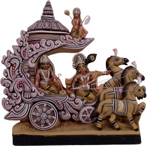
         <img class="responsive-image round-image" src="../docs/assets/images/krsn_arjun_sclputure.jpeg" alt=""/>
         <div class="p-sm">LOGO</div>
      </div>
      <div class="navbar-search-container">
         <input type="text" class="input-field"
            placeholder="What are you looking for?"
            >
         <button class="btn btn-primary">Search</button>
      </div>
      </div>
      <div class="navbar-right">
      <ul class="navbar-icons list-style-none list-display-inline">
         <li><a href="">
            HOME
            </a>
         </li>
         <li><a href="#">
            PRODUCTS
            </a>
         </li>
         <li><a href="#">
            ABOUT US
            </a>
         </li>
         <li><a href="#">
            <span>
            <i class="fas fa-user "></i>
            </span>
            </a>
         </li>
         <li><a href="#">
            <span>
            <i class="fas fa-heart"></i>
            </span>
            </a>
         </li>
         <li><a href="#">
            <span>
            <i class="fas fa-shopping-cart"></i>
            </span>
            </a>
         </li>
      </ul>
      </div>
</div><div class="navbar">
<div class="navbar-left">
<div class="navbar-logo">
<img class="responsive-image round-image" src="../docs/assets/images/krsn_arjun_sclputure.jpeg" alt=""/>
<div class="p-sm">LOGO</div>
</div>
</div>
<div class="navbar-right">
<ul class="navbar-icons list-style-none list-display-inline flex-row">
<li><a href="">
HOME
</a>
</li>
<li><a href="#">
PRODUCTS
</a>
</li>
<li><a href="#">
ABOUT US
</a>
</li>
<li><a href="#">
<span>
<i class="fas fa-user "></i>
</span>
</a>
</li>
<li><a href="#">
<span>
<i class="fas fa-heart"></i>
</span>
</a>
</li>
<li><a href="#">
<span>
<i class="fas fa-shopping-cart"></i>
</span>
</a>
</li>
</ul>
</div>
</div>
Usecase
- This component is made using flex box, with navbar classes you can customize your navbar
- You can use this component just by replacing your text with the given text, position is by default sticky and top:0.
Rating
Ratings are used for to filter content based on previous user feedbacks.
<div class="star-rating">
<input type="radio" id="5-stars" name="rating" value="5">
<label for="5-stars" class="star">★</label>
<input type="radio" id="4-stars" name="rating" value="4">
<label for="4-stars" class="star">★</label>
<input type="radio" id="3-stars" name="rating" value="3">
<label for="3-stars" class="star">★</label>
<input type="radio" id="2-stars" name="rating" value="2">
<label for="2-stars" class="star">★</label>
<input type="radio" id="1-star" name="rating" value="1">
<label for="1-star" class="star">★</label>
</div>
Usecase
-
use
.star-ratingfor grouping star elements - Can be used in filters
